
KLEIR
KLEIR brings an editorial fashion campaign and a connected shopping experience together for The 01 Drop, from the first impression to checkout.
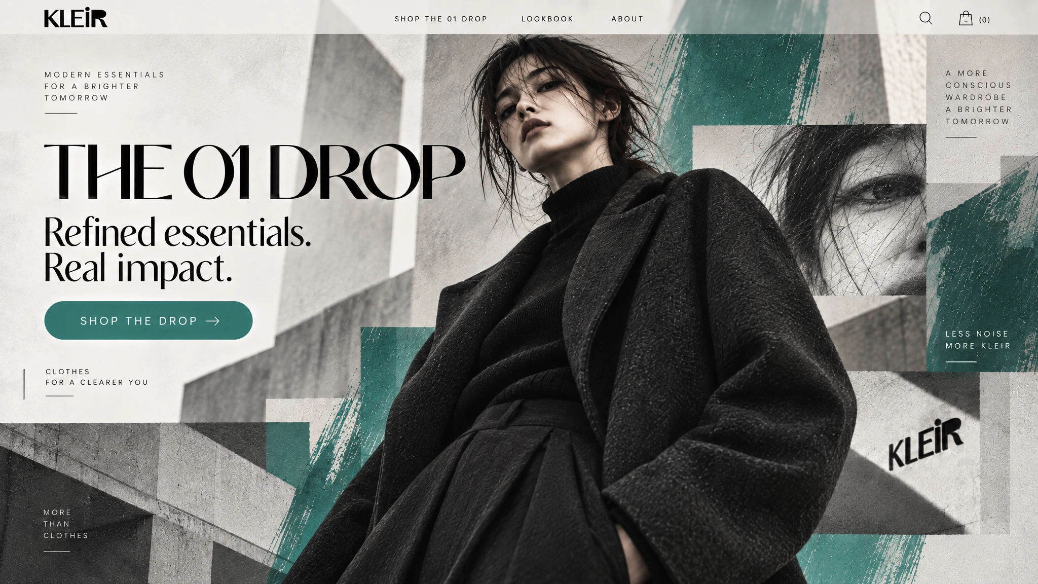
Creative Direction · Web Design · E-commerce · Campaign Creative
The campaign needed to express the collection's sharp fashion point of view while making browsing, product details and purchase actions clear across the shopping journey.
The refined KLEIR wordmark gives the fashion project a confident mark that holds up across campaign and commerce layouts.
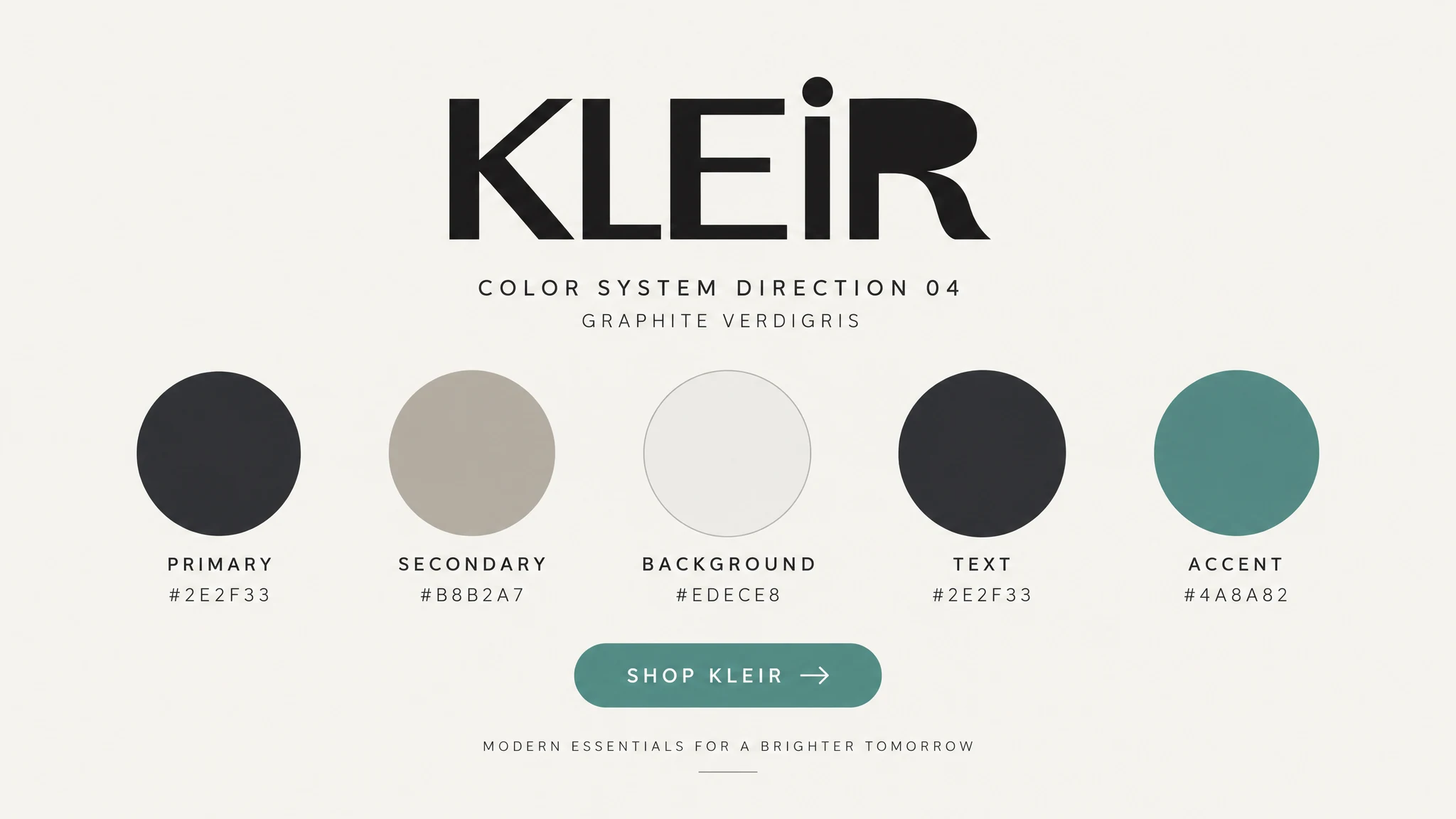
Graphite, warm neutrals and verdigris green create contrast while keeping the clothing and photography at the centre.
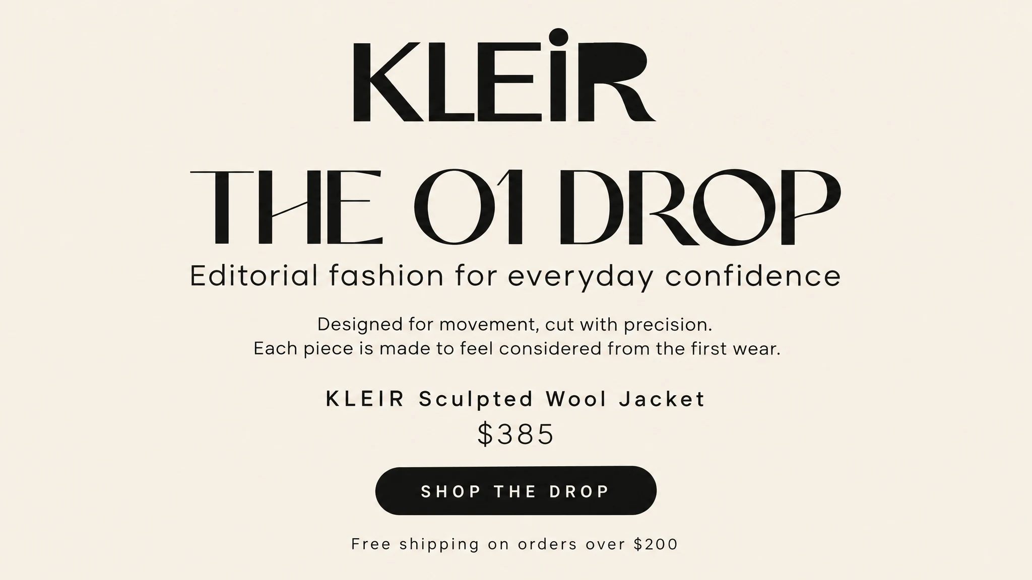
Large fashion headlines and compact utility text establish a hierarchy that moves between campaign and shopping moments.
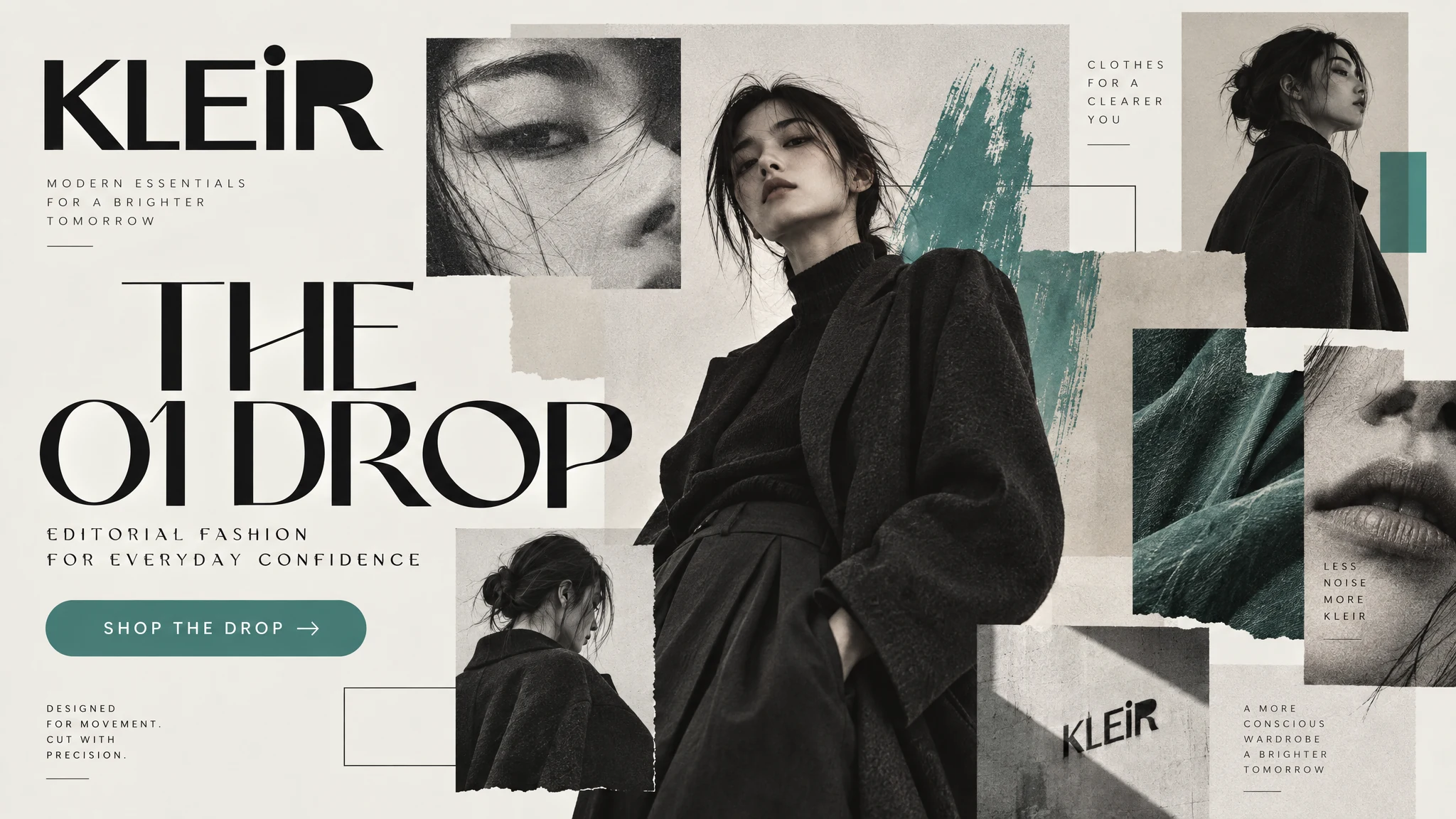
Layered portraits, architectural shapes and textured green surfaces make the collection imagery immediately identifiable.
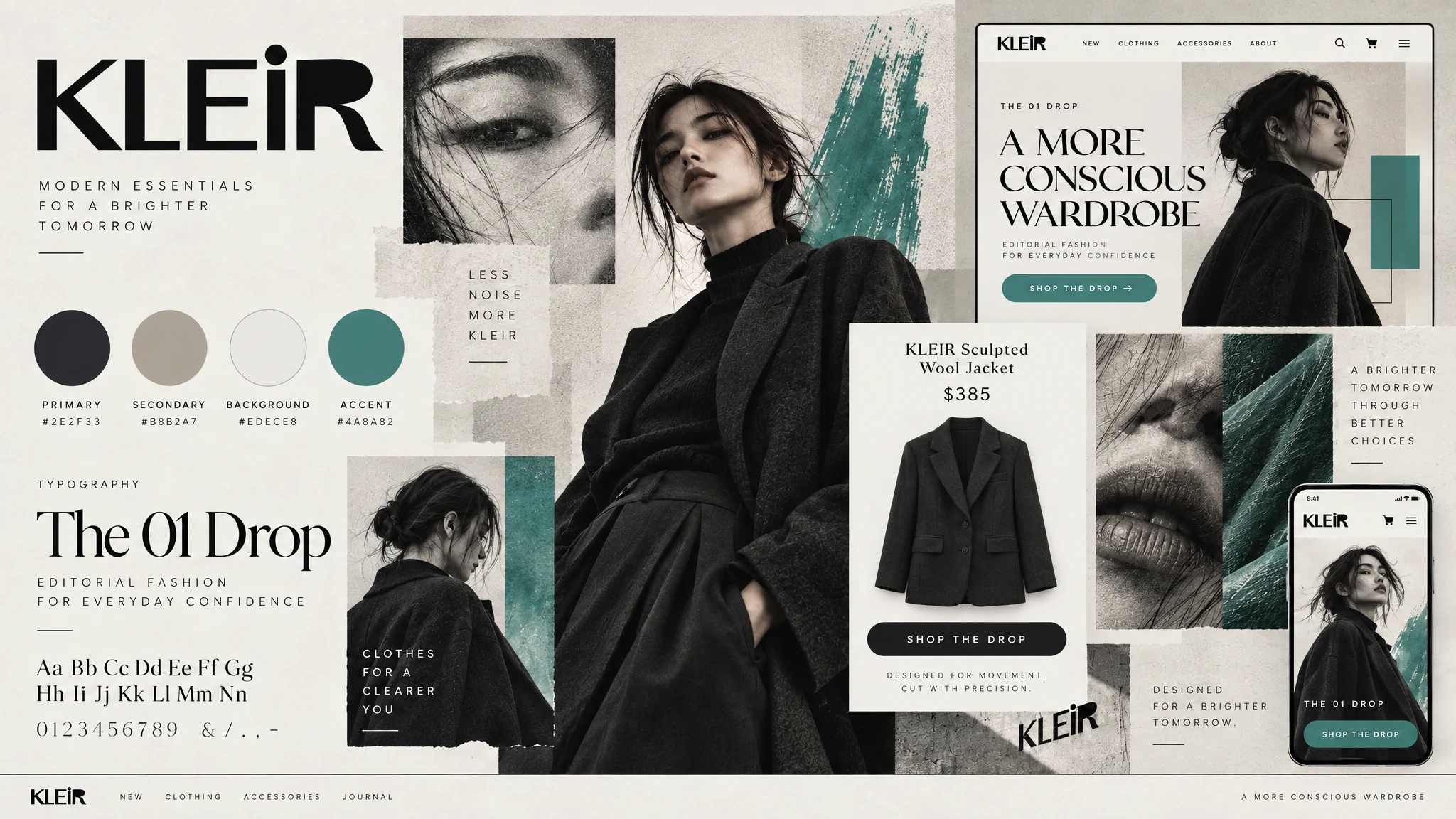
The wordmark, restrained palette, editorial imagery and campaign layouts come together as one recognisable KLEIR identity.
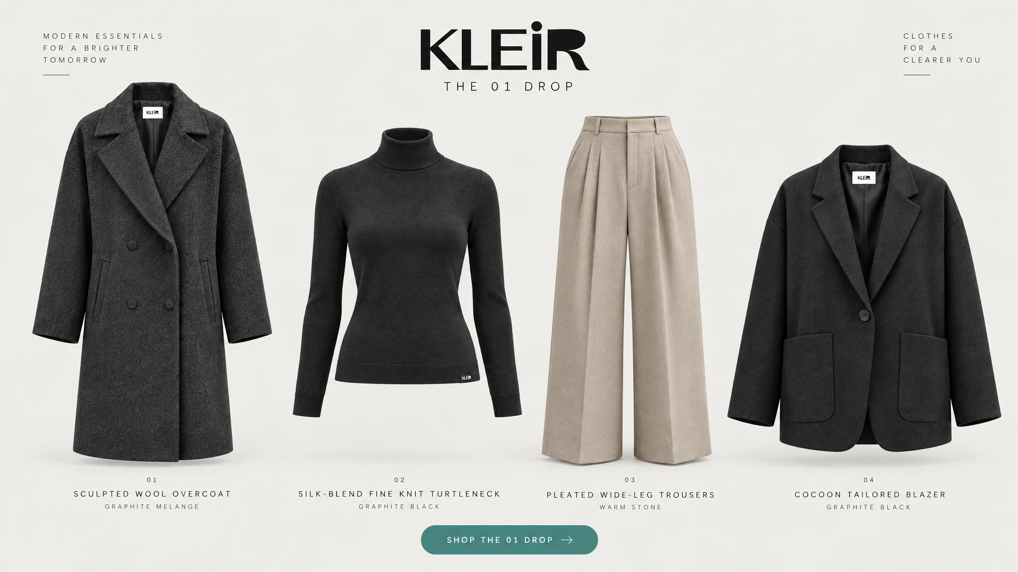
The clean e-commerce product set gives each garment a consistent presentation before the closer editorial storytelling begins.
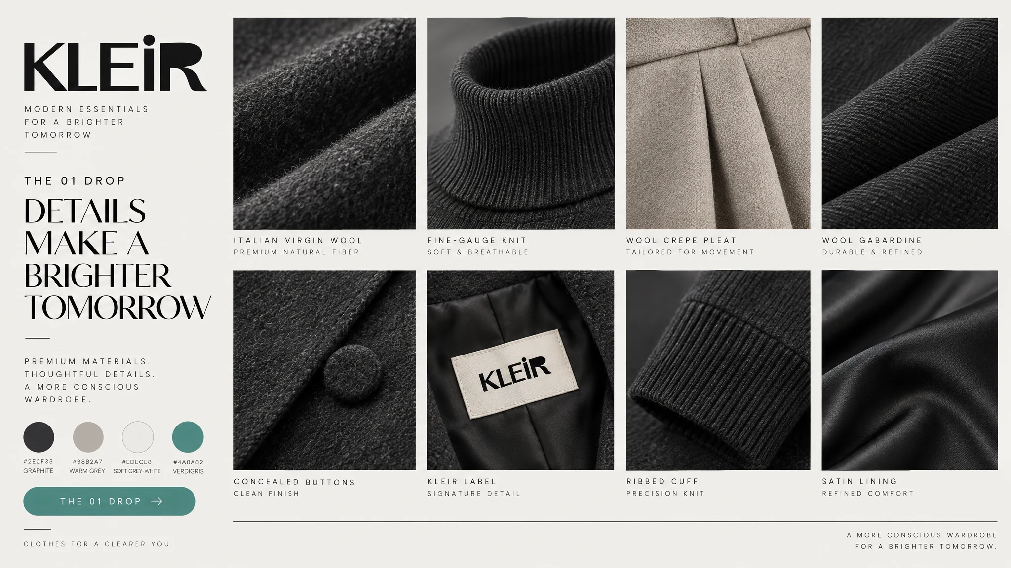
Close views of fabric, finish and construction support the product story with visible details.
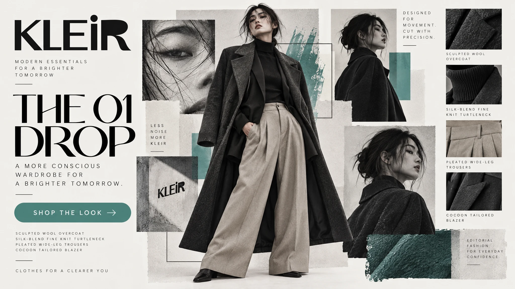
A full-length editorial composition connects the clothing, styling and graphic language in a single campaign image.
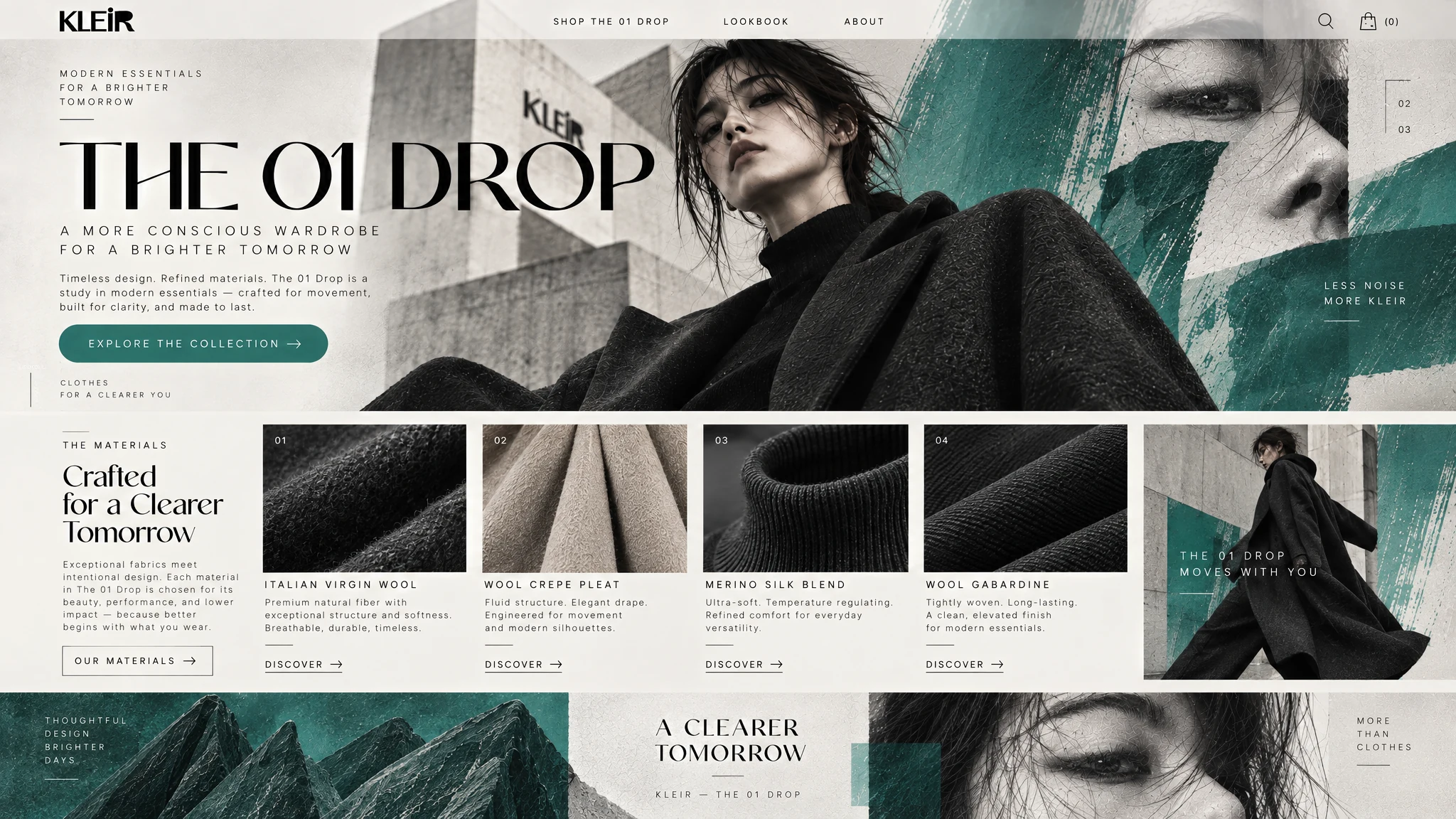
The editorial headline, portrait and restrained green accent introduce The 01 Drop while keeping the collection close to the first interaction.
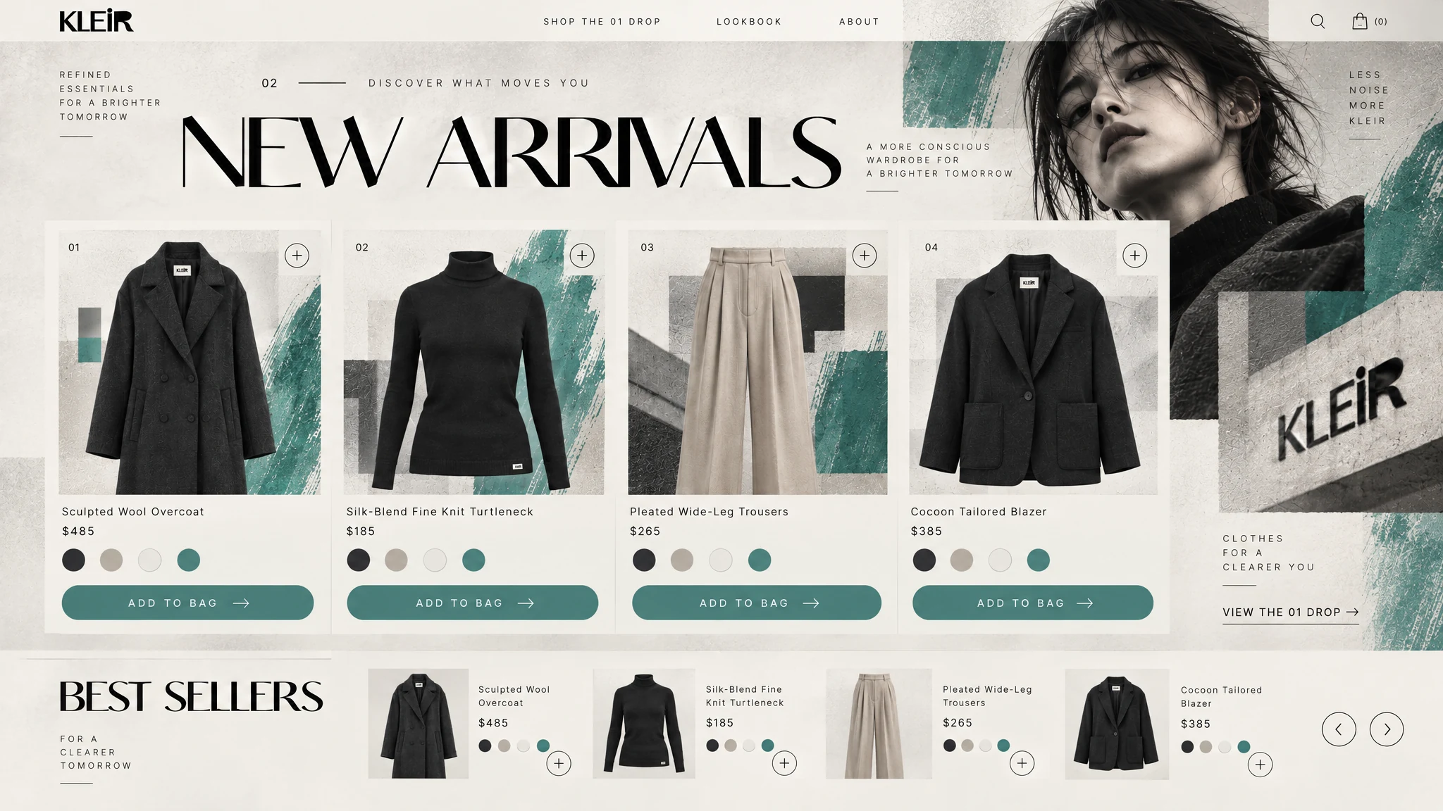
New arrivals and product cards carry the editorial language into a direct, shoppable homepage section.
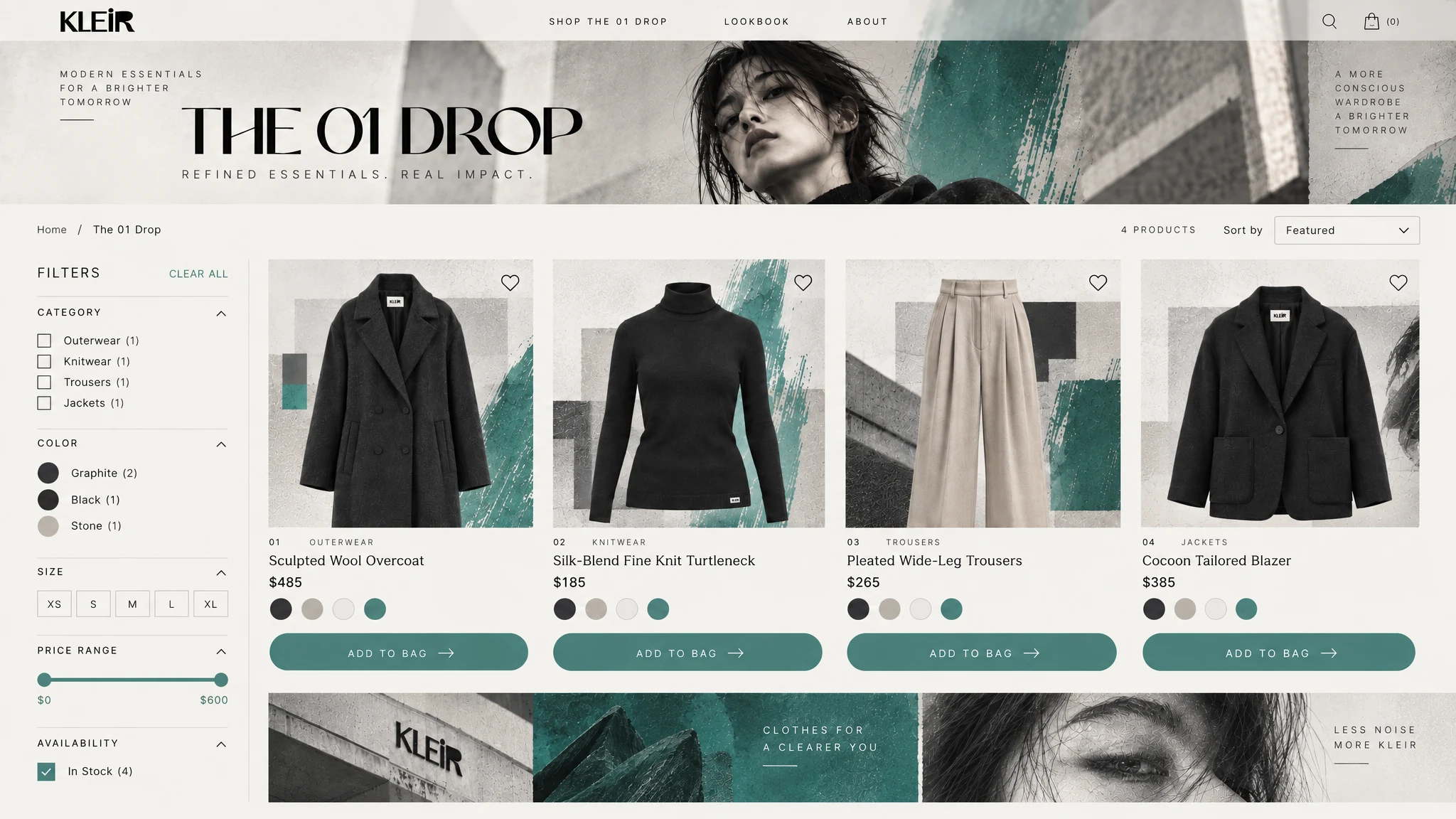
Clear filters, sorting and product cards make the collection easy to browse while keeping the campaign's fashion direction in view.
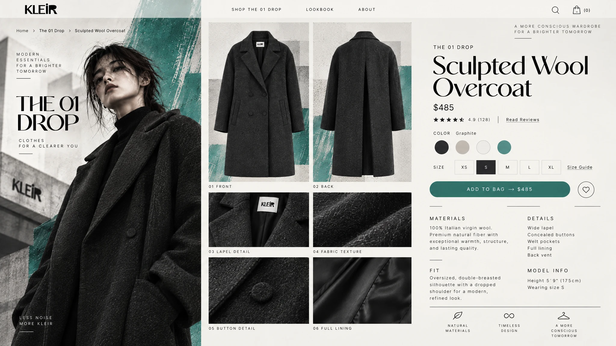
The product page combines editorial imagery with materials, fit, colour options and a direct add-to-bag action.
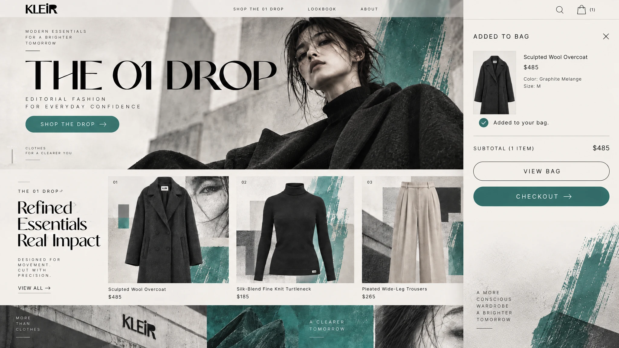
The add-to-bag panel confirms the selected product and keeps the checkout action in view without leaving the collection behind.
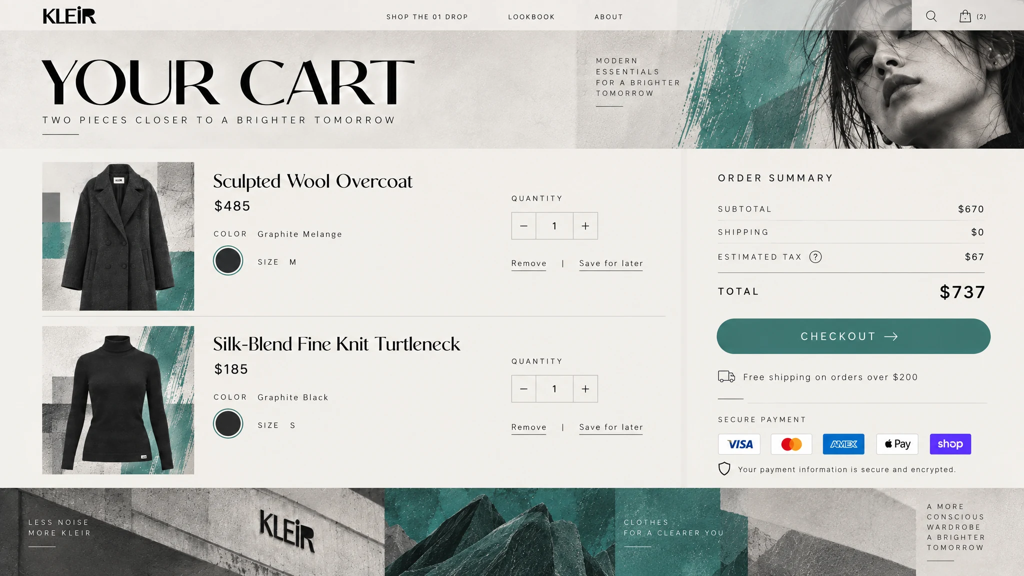
Items, quantities, delivery progress and order summary make the move to checkout straightforward.
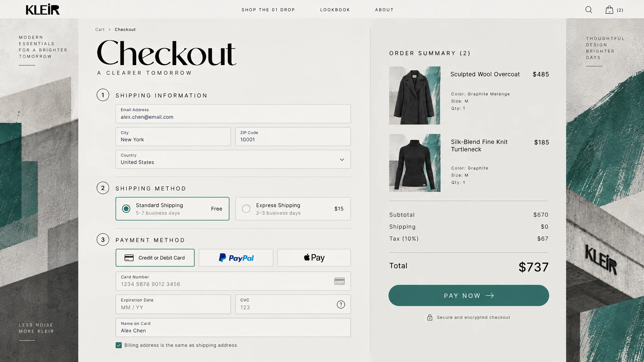
Product summary, delivery and payment are presented in a simple two-column flow that carries the campaign styling through purchase.
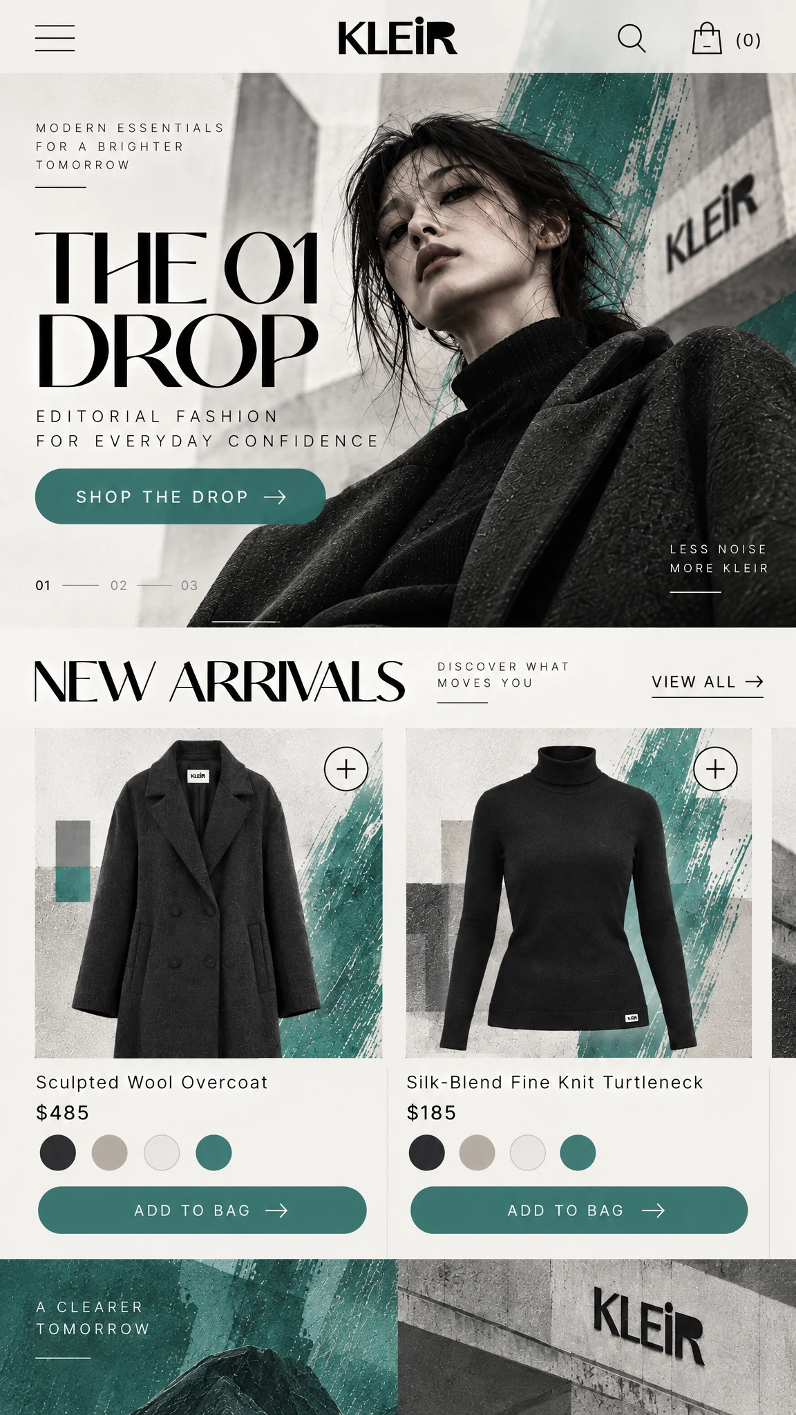
The campaign headline, product imagery and first shopping action keep their hierarchy on a narrow screen.
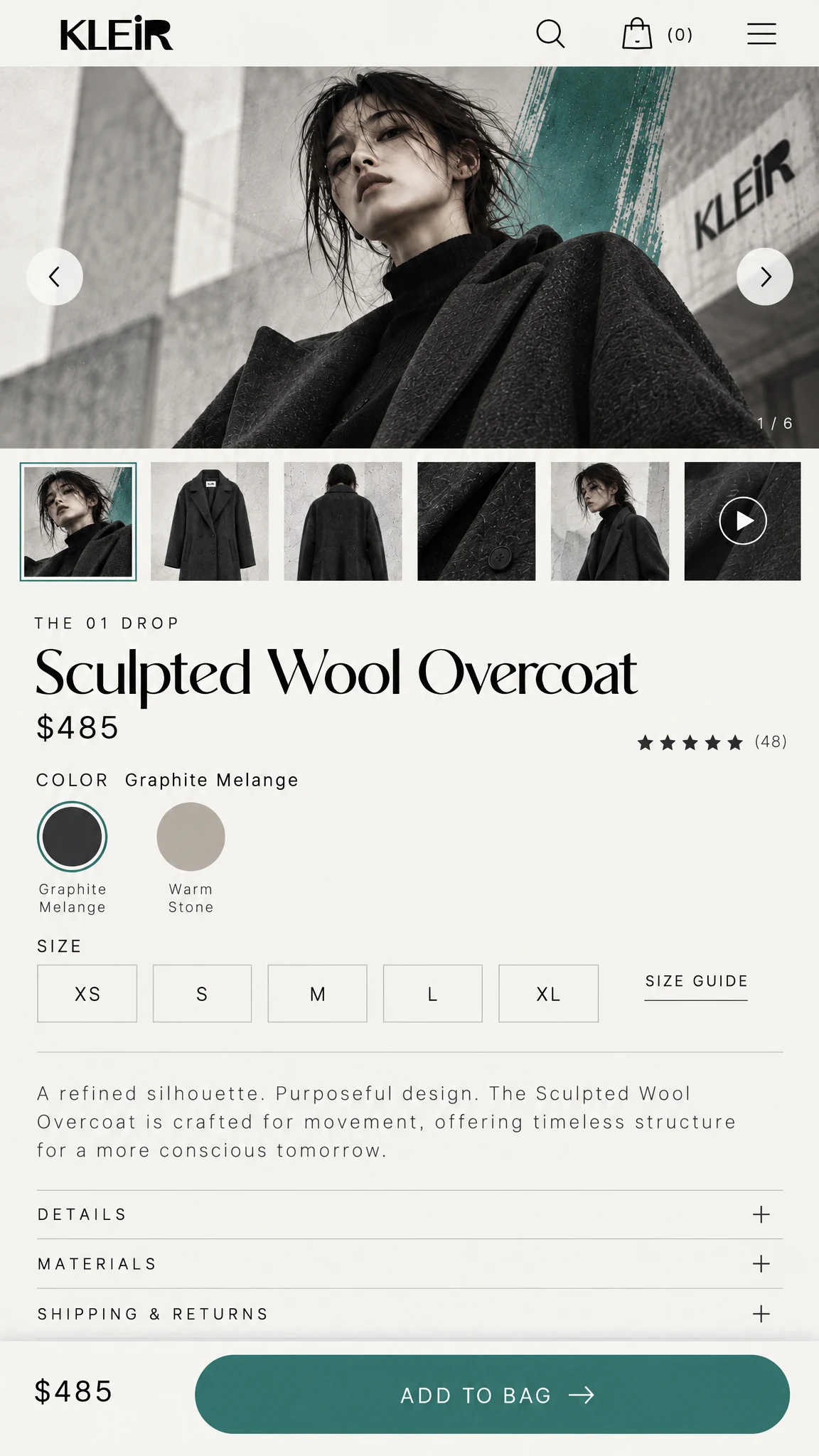
Images, size and colour choices, product information and the add-to-bag action remain easy to follow on mobile.
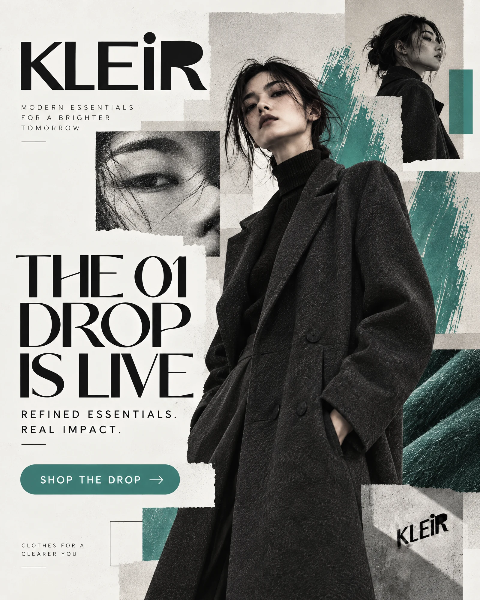
The same portrait, typography and green accent translate the collection into a direct social ad.
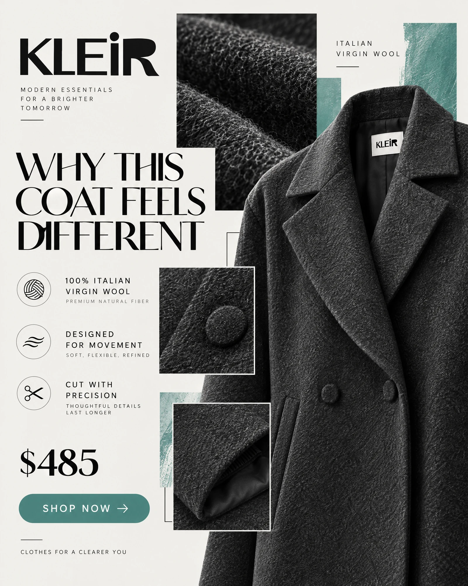
Close-up photography and concise product proof give the campaign a more considered selling angle.
The creative idea
ONE CLEAR IDEA
A WHOLE BRAND WORLD
Oversized editorial typography, confident portraiture and mineral-green accents form a consistent visual language. The landing page, collection, product page, cart and checkout carry that language into a clear path to purchase, supported by focused paid-social concepts.